Back to top: Configuration
The epistemic dimension
The second dimension of the epistemic process centers on the presentation and conveyance of knowledge. When it comes to present data, a number of different modalities have been used over time.
In their original configuration, data are juxtaposed according to a single factor, such as the chronological sequence in a list of transactions, or the alphabetical sequence in a list of words. This order does not add up to a statement about a meaningful whole. Hence the need for different modalities that give a new unity to the data.
This goal is achieved by organizing the data in alternative configurations. These configurationscan take different shapes, which are visual in nature,
Being “visual,” these presentations cannot reside in the purely linguistic medium, and are tied instead to graphic devices, all linked in principle to writing as a process. 1
I will mention here three pre-digital modalities that indicate how long standing and well established this effort has been since the very beginning of writing. (For a visual equivalent in the narrative style see below.)
Back to top: Configuration
1. Lists
This administrative tablet from Drehem dated to a little before 2000 B.C. (Buccellati 1966 Amorites p. 62, N. 18), lists animals brought in to the pens of the great temple of Enlil in Nippur by different people on different days during the 12th month of Amar-Sin's fifth year of reign.
The primary order is thus chronological, but in the last column an alternate order is given: a series of sub-totals by type of animal, followed by the grand total. These totals are set off by extra space on the tablet, which visually highlights their role, as with the date which follows at the very end.
|
 @50.jpg)
|
Back to top: Configuration
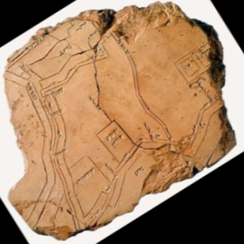
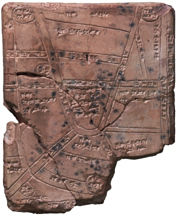
2. Maps
Mapping geographical features is an eloquent example of what visual display means:
- the relative proximity of the features,
- their proportional difference in size,
- the overall organization of space,
these data reflect an order that could otherwise be rendered but with the longest prose description. Mapping provides a wholly unique graphic medium for achieving these goals.
These two maps are inscribed on clay tablets found in the ancient city of Nippur, and dating to the latter part of the second millennium.
The first (Gibson 1993) renders the city of Nippu itself, with details of the major buildings (the Ekur ziggurat is on the upper right) and the principal water ways, including the Euphrates on the left
The second (Langdon 1916) renders an agricultural area near Nippur, indicating canals, fields and villages.
What prompted the production of these maps remains solmewhat obscure, but what is significant for our purposes is the lucidity of the method: the scribes were perfectly successful in their enterprise, and we can only imagine how they would have arrived at these results, and what kind of training had to be set in place to ensure that these most ingenious configurations of the data might not remain but isolated scribal efforts.
|
|
|
Back to top: Configuration
3. “Figurative charts”
This chart by Charles Joseph Minard is dated to 1869 (AD !), and its importance has been emphasized especially by Tufte. It represents the progress of Napoleon's campaign against Russia: the band in light brown shows the advance, and the black band shows the retreat. Several major variables are combined:
- the size of the army (which becomes progressively smaller),
- the distance covered,
- the chronological steps,
- the changes in temperature.
|
|
Back to top: Configuration
The digital impact
The major innovation afforded by a digital database is the possibility it provides to create instant visual renderings of quantitative information, once the data are stored digitally according to a fully developed categorization. There is almost no limit to the quantity of data that can be processed, and a wide variety of visual configurations are possible, such as bar histograms, pie charts, radar charts.
Back to top: Configuration
Sense of the whole
Partly because of the quantity of data that can be stored in a database, and partly because of the very nature of the digital medium, one does not get a sense of the whole by simply entering a data base.
The types of visual display we have seen offer a major epistemic side effect precisely because they provide the sense of the whole that is missing in the data in their original configuration. We see this in the examples given above, specifically in:
- the totals in the list of animals from Drehem,
- the general configuration of space in the maps,
- the compression of data relating to the army in the "figurative chart"
- the total in decreasing order of frequency in the bar histograms.
Back to top: Configuration
Notes
1^
The notion of graphic rendering of data has been developed in detail by Edward Tufte, especially in his book on Visual Display of Quantitative Information.
Back to top: Configuration